I've been admiring every one of your Kaspars (and your Popeyes too) Great work.
I love how loose and flowing your lines are. I'm not that far along myself.
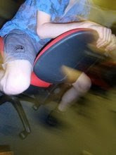
This is one that JohnK used to demonstrate what he wanted. It's interesting to compare his vs yours. One subtle difference is that he put more twist in the face - the mouth on his is left behind as the muzzle twists. And the eyes on his elongate - as if the pupils are pulling away.
Also - and this is really subtle - his forms look a bit rounder and 3-dimensional. Note the meat on the thigh closest to us. Also the pinkie toe closest to us. I'm not even sure how he does that!
It was helpful to me to see, by comparison, some of the subtle things JohnK does that I wouldn't otherwise have noticed. I'll keep watching and learning from you, as you are well ahead of the game.
Yeah, the details that make John K's work so great are hard to catch - but I've sure learnt a lot from trying!(you're right about mine not being as 3D)


2 comments:
I've been admiring every one of your Kaspars (and your Popeyes too) Great work.
I love how loose and flowing your lines are. I'm not that far along myself.
This is one that JohnK used to demonstrate what he wanted. It's interesting to compare his vs yours. One subtle difference is that he put more twist in the face - the mouth on his is left behind as the muzzle twists. And the eyes on his elongate - as if the pupils are pulling away.
Also - and this is really subtle - his forms look a bit rounder and 3-dimensional. Note the meat on the thigh closest to us. Also the pinkie toe closest to us. I'm not even sure how he does that!
It was helpful to me to see, by comparison, some of the subtle things JohnK does that I wouldn't otherwise have noticed. I'll keep watching and learning from you, as you are well ahead of the game.
Yeah, the details that make John K's work so great are hard to catch - but I've sure learnt a lot from trying!(you're right about mine not being as 3D)
Thanks for the comment!
Post a Comment